Drag & Drop
AI-Powered
Plugin Architecture
React 19
TypeScript
Build content editors that ship.
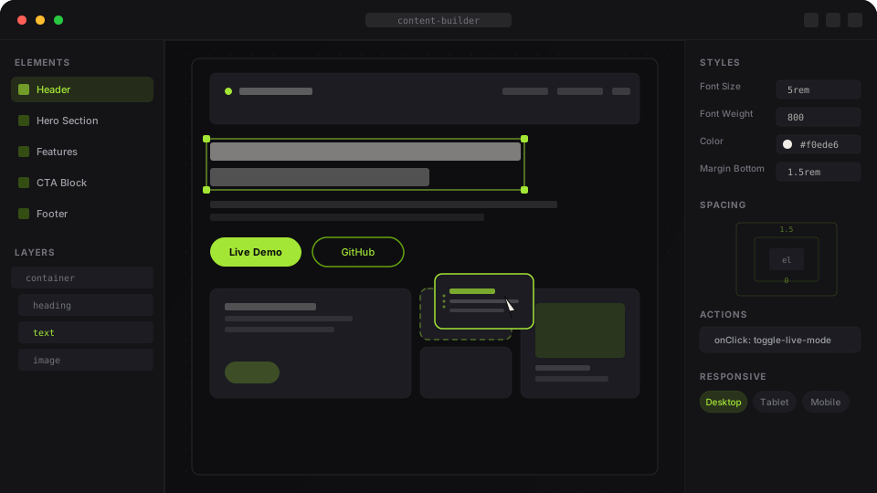
A flexible React framework for building rich, interactive page editors — drag-and-drop layouts, AI generation, and a fully pluggable architecture. Inspired by visual builders like Webflow and WordPress.
Private beta — published to a private GitHub Packages registry. This site is a showcase only.
Features
Everything you need. Nothing you don't.
Flexible Element System
Nest containers, text, headings, images, buttons, links, and custom components in any configuration.
Multi-Device Responsive
Desktop, tablet, and mobile breakpoints built in. Override any style property per device.
Plugin Architecture
Modular sidebar tabs — Elements, Layers, Styles, Actions, Variables, Assets, CMS, i18n, History.
Action System
Attach typed actions to any element. Open dialogs, navigate, log, or define fully custom handlers.
AI Prompt Generation
Generate entire element trees from natural language. Streams results via your own AI endpoint.
Undo / Redo & Live Mode
Full history stack with Cmd+Z. Toggle live mode to preview the exact rendered output instantly.
How it works
Up and running in minutes.
01
Install the package
Add the package from the private GitHub registry. Configure your .npmrc with @henrynoowah:registry=https://npm.pkg.github.com and your auth token.
02
Wrap with EditorProvider
Mount EditorProvider with your page details, variables, and action maps. It manages all editor state internally.
03
Add sidebar plugins
Compose your sidebar from pre-built tabs — Elements, Layers, Styles, AI Prompt, CMS, and more. Each tab is a configurable instance.
04
Save & render
Use onSave to persist element trees. Render saved content with the included Renderer component — no editor UI needed.
Get in Touch
Let's build something together.
Interested in using content-builder for your project? Have questions or feedback? Drop us a message.
Showcase
Your editor.
Your rules.
Built different.
This package is published to a private GitHub Packages registry. This site is a showcase of its capabilities.